Detail: stylized photo from website, features two men talking while fishing with a subtle green and blue color blur effect.
Detail: blurred out brand colors (pink, blue, green) with a text bubble featuring the tagline "If you need to talk, the 988 Lifeline is here."
Detail: rounded buttons with minimalist icons representing the four ways to connect (Chat, Text, Call and ASL Now).
Detail: stylized image and client logo from the redesign featuring a mother and child embracing.
Detail: stylized rendering of card element from redesign.
Detail: typeface specimen (Public Sans) from the redesign.
Detail: zoomed in view of a mobile phone with the 988 favicon in the top left corner.

We developed a website and design system for the national rollout of the 988 Suicide & Crisis Lifeline, supporting millions of visitors seeking help.

Our Client

The 988 Suicide & Crisis Lifeline provides free, confidential support to people in emotional distress, helping individuals and communities find hope and connection in moments of crisis.

Our Approach

For the national launch and rebrand, Made by We created a unified web design system that successfully brought the new 988 identity to life online, reaching 6M+ active users over 12 months. We collaborated closely with Vibrant Emotional Health and the overseeing government department, SAMHSA, for a coordinated joint launch.

Scope

_ Strategy
_ Brand Expansion
_ Web Design
_ WordPress Dev
_ Multilingual
_ Migration

Laptop on a well-lit table featuring the 988 Lifeline homepage.
Detail: Zoom in on the chat, call, and text icons.
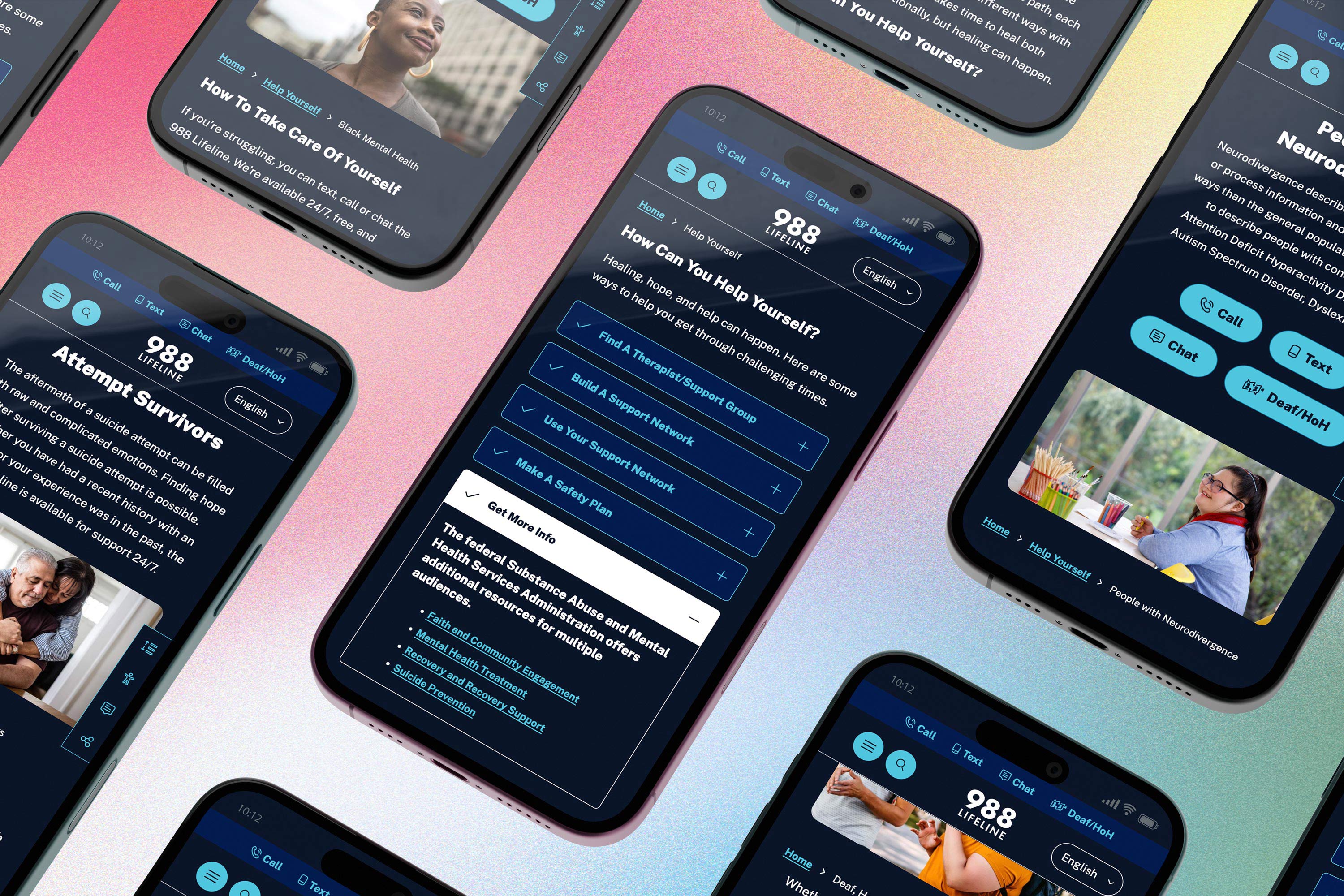
Grid of mobile page layouts featuring different pages in dark mode.

1%

1%

1%

Top 1% Performing Homepage for Accessibility Ranking from WebAIM 2025

6M+

6M+

6M+

Active users over 12 months

Active users over 12 months

100%

100%

100%

Lighthouse Mobile Best Practices Score

200

200

200

Custom branded components configured in Figma in 4 color modes

Side by side view of light and dark mode colors.

We created a structured color foundation that powers accessible, user-selectable modes.

We created four accessible color modes: Light, Dark, High-Contrast Light (AAA), and High-Contrast Dark (AAA), supporting a wide range of user needs and preferences. The site fully adapts to a visitor’s system-level preferences, and users can also manually select their preferred mode for optimal comfort and accessibility.

Expanding the Brand Palette for Accessibility

We evolved the 988 brand colors into a fully AA-compliant palette, testing every combination across site components so content managers can focus on creating content, not checking contrast ratios.

Color grid analyis of brand colors with AAA, AA, AA18 and DNP ratings.
Three side by side mobile view mockups showing the homepage, FAQ list and a demographic page.
Three side by side mobile view mockups showing the homepage, FAQ list and a demographic page with a heatmap overlay, demonstrating where on each page was the most activity.
Three side by side mobile view mockups showing the homepage, FAQ list and a demographic page.
Three side by side mobile view mockups showing the homepage, FAQ list and a demographic page with a heatmap overlay, demonstrating where on each page was the most activity.
Three side by side mobile view mockups showing the homepage, FAQ list and a demographic page.
Three side by side mobile view mockups showing the homepage, FAQ list and a demographic page with a heatmap overlay, demonstrating where on each page was the most activity.
Detail: stylized rendering of card element from redesign.
A hand is holding a mobile phone featuring a photo header and an accordion with tips on how to take care of yourself from the 988 website.

Project Summary

Made by We was engaged to conduct a deep discovery process to help the National Suicide Prevention Lifeline (NSPL) understand how people were actually using their website. This work included 15 one-on-one interviews, 122 survey responses, 7 moderated UX and tree-testing sessions, 24,000 page recordings, 6 page-level heatmaps, and an analysis of 12 months of Google Analytics data. Together, this research highlighted where the site was helping, and where it was unintentionally creating friction for people in moments of crisis.

When NSPL transitioned to the newly designated three-digit number, 988, they tasked us with rebuilding their website. We identified three primary goals to guide the redesign: helping people reach support quickly through clear and simplified content, expanding access through multilingual content, and establishing a flexible design system that could evolve alongside the developing 988 brand. Throughout the project, we collaborated closely with SAMHSA, Vibrant, and an external marketing team, all while working toward a public launch date.

We used predictive heat-mapping to determine optimal placement for the four ways to connect with a counselor (Call, Text, Chat, and American Sign Language) so visitors in crisis could immediately find the support they needed.

One of the top visited pages on the site was the most Frequently Asked Questions (FAQs), which received one of the most significant content enhancements. Previously presented as one long page, this information is now a category-organized resource with individual links for each question (and answer). This shift gives visitors a direct path to answers while also making the content more discoverable and shareable overall.

To support long-term scalability and editorial independence, we created 200 custom-branded components organized into a Figma library. These components were the foundation of a Custom WordPress Site, which features a block-based page editing system for content administrators. Editors can mix-and-match 20+ styled content block options to create new pages from scratch without breaking from established design patterns. Every block supports all four site-wide color modes and maintains a minimum 4.5:1 contrast, so editors never need to manually evaluate accessibility. The site launched with two fully translated languages and is configured to support more in the future.

Clarity guided every part of the build: from high-contrast modes to a dyslexia-friendly typeface. The impact is reflected in the data. Comparing 10/2024 - 10/2025 to the previous year’s data (10/2023- 10/2024), GA4 shows an 83% increase in average engagement time.